E-commerce website design trends in 2024

With a new year comes a new change!
Things, persons, attitudes or trends- almost everything goes on the verge of becoming a better version, burying the old, negative and dysfunctional traditions.
These changes also appear in the dynamic world of e-commerce web design.
New trends in design and functionality evolve, focusing on user experience and convenience.
This year, e-commerce website designers will also embrace some new or existing web trends that work out the best.
In this article, we take a look at what e-commerce website design trends in 2024 will become the new normal.
Let’s start!
1. Beyond the grid: Embracing unconventional layouts
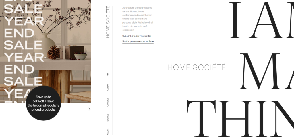
Unlike traditional web design layouts that use a simple grid system to show products or present information, asymmetrical layouts will get more love in 2024.
Conventional grids like F or Z patterns structure content in a predictable way.
They are good until it’s about making a webpage easy to understand.
But when it comes to creativity, asymmetrical layouts get the spot.
In this kind of layout, the structure of content remains unpredictable.
That means page elements, instead of being static, organically cascade over the screen from any direction as soon the user scrolls through.

Image source- homesociete.ca/
Moreover, dynamic scrolling effects like Parallax scrolling give users a more immersive experience.
Other features like-
- leaving more white spaces
- playful overlapping to highlight information
make it even more interesting.
Adopting such a layout in e-commerce website design eliminates monotonous aspects and gives users interesting reasons to engage.
2. Vertical menus take the spotlight
Horizontal menus were a thing previously!
Now in, in website development, vertical menus are taking their place.
The reason is quite obvious. Vertical menus do not need much space. Instead, placing them as the sleek sidebar is possible.
Plus, organising categories in a shrink menu that expands only when the user hovers over them makes the website look uncluttered.
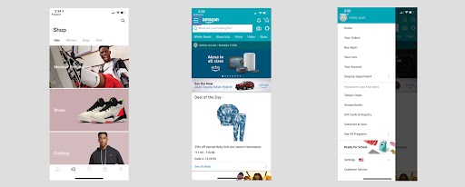
The reason behind doing so is that placing categories horizontally was good until people used big screens, i.e., desktops or laptops, to access them.
As we know, these days, mobiles are the main devices that the majority of people use to search for things.

And, because mobiles have small screens, adjusting content in them is a challenge.
In this scenario, vertical menus help save space and also keep up with Google’s mobile responsive web design ranking factor.
Read Also: The Importance of an E-commerce Website for Business Growth
3. Storytelling through animation and micro-interactions
Conveying brand messages or product information through static images is boring now.
Because user engagement requires dynamic and interactive elements, they will become more important in web design in 2024.
Showing products through animations, that on hover effect show transition brings your offering to life.
Think of it as hovering over a shoe image that rotates it in 3D.
This surely gives an immersive experience to users, making it a must to embrace the trend this year.
4. Voice search option is gaining prominence
As we see in the previous section, most searches are coming via mobile devices.
But out of those mobile searches, 27% of them come through voices, i.e., people prefer speaking on a mic rather than typing.
This tendency of users is leading towards implementing AI technology to add voice search options on websites.
Especially in E-commerce website design, voice search is becoming a prominent trend for 2024 and beyond.
The reason being, it is more common in online shopping for people to use their voice to find stuff, e.g., visiting the Amazon store and saying, “Find me Nike shoes” on the mic.
However, merely adding a voice search option is not enough until you invest in voice search optimisation.
So, for that, your e-commerce website design company should optimise your keywords or phrases that people may use to find products using voice.
Get to know: Website Design Mistakes to Avoid When Building or Revamping Your Site.
5. Integration of Chatbots becoming must have
A trend in websites that remains evergreen is focusing on user experience and convenience.
Enhancing UX with time remains the main priority.
Using tactics or even technologies, web owners strive to achieve that.
This year, the chatbots will be an integral part of this evolution.
Because they are capable of providing instant and 24×7 assistance, more and more e-commerce web owners add chatbots to their websites for a better customer experience.
Get expert help for your e-commerce store.
If you are exploring low-cost e-commerce website design services, Bitvero, a web design company in London, is glad to lend a hand.
We believe every business should get space in the online landscape. However, due to the budget aspect, some businesses hesitate to get one even if they want it so badly.
So, to help businesses with this challenge, we have carefully curated low-cost e-commerce website design packages that not only make it cheaper to sell online but also give the convenience of paying tough monthly direct debit.
Reach out to our physical location or give us a call at 020 374 52786
