The Power of Micro-Interactions: How Small Animations Can Boost Your Website’s UX
Website design these days is a necessary marketing tool. And it becomes even a great tool with a good UX.
Users, whether enquiring or purchasing, want a smooth process. This can be possible only if your website fulfils all UX criteria, from speed and design to technicalities. And, of course, Micro-interactions are also a part of it.
They can incredibly improve your overall website UX, and their fun and interesting element can retain users on your website for a long.
Let’s see how incredibly they can be helpful in your website design.
What are Micro-interactions?
Micro-interactions are those little happenings on your website that users experience when they take any action while browsing the website. They can be in the form of animations or other visual representations at any point, e.g., while clicking a button hovering over an image or during the loading process.
Though tiny effects, they can incredibly boost your website’s UX. Let’s understand how they can be beneficial for you.
Read also: How to choose branding elements for startup websites
Engage Users
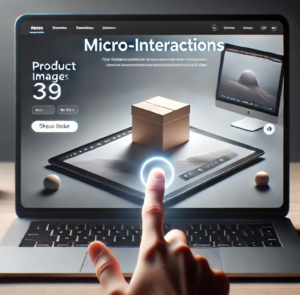
Good UX is meant to engage users. This is exactly what micro-interactions do. By engaging users on the website through content or anything else, they can retain them long. For instance, in an e-commerce website design, while hovering over a product image, an animation can slightly enlarge it or show it in three-dimensional form
Read also: E-commerce website design trends in 2024
Guide User Behavior
When users have an idea where their next step on the website will take them, it is considered a satisfying user journey. In this scenario, small animations appear at points, guiding users to the next move. This can be through a call-to-action bouncing, moving, or changing colour to attract user attention and direct the user navigation process.
Read also: How Startups can Boost Business Conversion with their Websites?
Provides Feedback
When you like a post on Instagram, a red heart appears that grows larger and tells you have successfully liked the post so that you have no doubts about your actions. This is a perfect example of micro-interactions that assure users that the actions were completed. Just like on Instagram, your website also needs to give some signals to users when they want to complete an action and want validation.
Let’s say you have a small business website with an Add-to-cart option that changes colours or sparkles when users put something into the cart, highlighting that the user’s actions were complete.
Fun Interaction
Apart from engaging users and giving feedback, micro-interactions can also be fun elements on the website, which again can retain users.
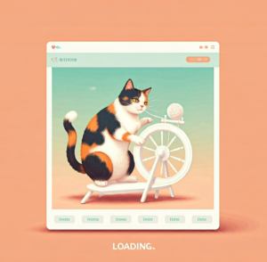
When there is loading in the process, a quirky animation can appear, attracting users’ attention and making them forget the frustrations of a slow-loading website.
Read also: The Role of AI-powered Chatbots in Customer Engagement & Lead Generation
Improve Usability
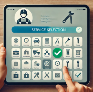
Micro Interactions can also help make the process intuitive on your website so that users can confirm that what they have chosen has been registered without any lengthy or hassle-laden procedures. For example, in a handyman website design service, you can add a checkmark that pops up when users select from your services so that they know they have clarity for further processing.
Read also: Handyman Website Tips That Boost Revenue
Looking for a website design company in London?
If you are already in search of web design services for small business or startups, Bitvero is a call away. With ten years of experience, we have designed several websites for our clients- both in the UK and abroad. Check out our website design portfolio or call us on

